- Joined
- Jul 17, 2023
- Threads
- 28
- Messages
- 116
- Reaction score
- 101
- Location
- Austin, TX
- Vehicle(s)
- Ford Maverick XLT
- Engine
- 2.5L Hybrid
- Thread starter
- #1
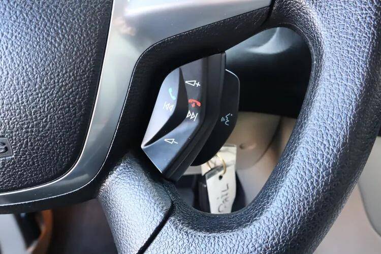
I owned the truck for two years now, I still am not used to the button layout. Often I push the wrong button and/or I need to look down to remind myself which button is to pick up the phone and which is to hang up the call. Perhaps I am just too used to Japanese car layouts but I think the Ford layout is just not intuitive:
1. Volume up should be on the far right and volume down should be the far left, and mute button in the middle.
2. Pick up the call (and previous sound track) should be the left, hang up the call (next track) should be on the right, and Siri button in the middle.
And the cruise country is equally hard to remember. I am much prefer Toyota's design, Much simpler and never needed to look down
I am done with my rant. Still love the truck though.
Sponsored